Concepts in the Convier platform
Convier connects data from distributed data sources (f.ex. internal databases, CRM systems or external API services) and meshes the data together into data views and documentation workflows. The platform consists of different functionality concepts for presenting and analyzing data, as well as moving through and documenting an analysis workflow. This section contains a description of the most important concepts in the Convier platform:
Objects
Data objects are at the center of the Convier data model. An object is the representation of some entity in a data set. An example of an object could be a customer, a bank account or a transaction.
To open the object view of a certain data object, you can search for the object, or click a link to this object from another view.
Objects consist of a collection of properties, containing data points descring the object in question. Examples of properties can be a customer’s ID number, a transaction’s amount or the date an account was opened.
The object view
An object view will contain all the available information related to some object. The below example shows the object view for a Customer.
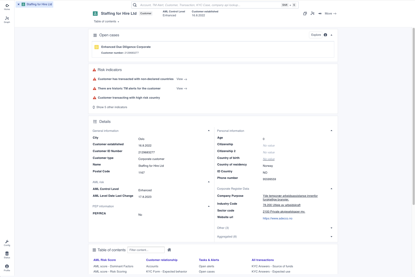 An object view for a Customer object
The object view typically includes the following elements:
- The risk indicators summarizing the detected risk factors on the object.
- A “Details”-chart containing all the object’s properties
- A Table of Contents giving an overview of all the subpages containing related data
Links
Links is the underlying mechanism that represents relationships in the data connected to Convier. A link describes some sort of relationship between two objects. The link can exist between objects of the same type, or between different object types. Links can also exist between data objects from different origin sources.
Examples of a link between objects:
- Two objects that represent information about a specific business customer across different data sources (f.ex. an object containin customer information from the internal customer database and another containing information from a public business registry). These two objects contain information related to the same physical business, and can therefore be represented as two linked objects.
- Two separate customer entities that share the same address. These objects represent two different physical customer entities, but since they have related information they can be represented as linked objects.
- The fact that a person is a shareholder in a company can be represented as a link between the Person and the Company objects.
Charts
A chart is a way of visually displaying data retrieved by some pre-configured search. An example of such a search could be to start with a Customer object, find all linked Transaction objects and then filter to show only transactions from the last 12 months. Data in Convier can be displayed in one of the following chart types:
Object list chart
An object list chart shows a list of objects, including some key data points. To view more information about a specific object in the list, click the list element to open the corresponding object view.
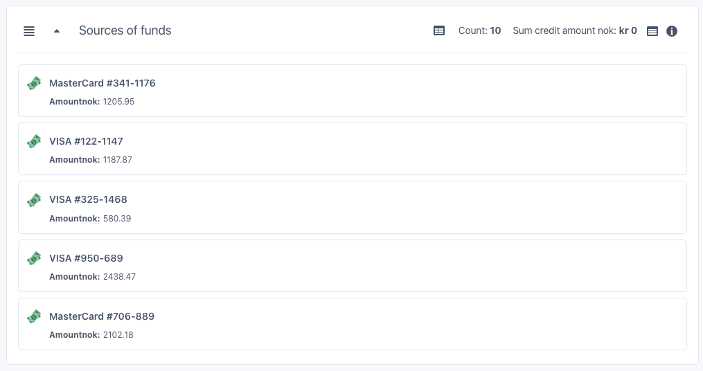
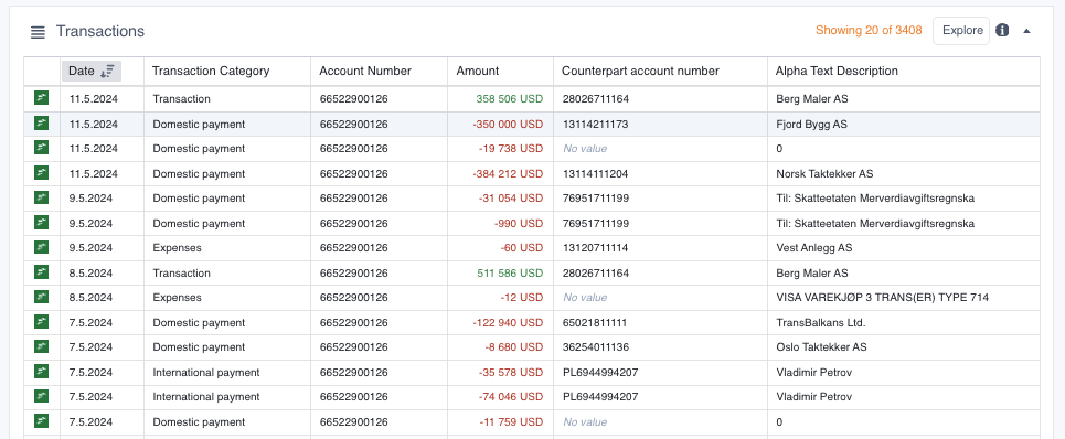
Table chart
A table chart shows a list of object data in a table format. To sort the data in the table, click the column header of the column you want to sort by. Clicking once will sort the data in ascending direction, clicking twice will sort in a descending direction. A sorting icon will indicate which direction and column the table is currectly sorted by.
The chart can be limited to show only a subset of all found objects, in this case the information text “Showing X of Y” will be displayed in the chart header. To see the entire list of objects returned by the underlying search, click the “Explore” button to open the Browse view. To see more information about a single object in the list, double click the row containing the object you want to investigate.
Aggregation chart
An aggregation chart groups together a collection of data by a value of choice. The aggregation chart can be sorted by clicking any of the displayed column headers. If you wish to see the detailed list of all objects making up one of the groups, click the “Explore” button to open the Browse view. To browse all the objects in all groups, click “Explore all”.
Comparison chart
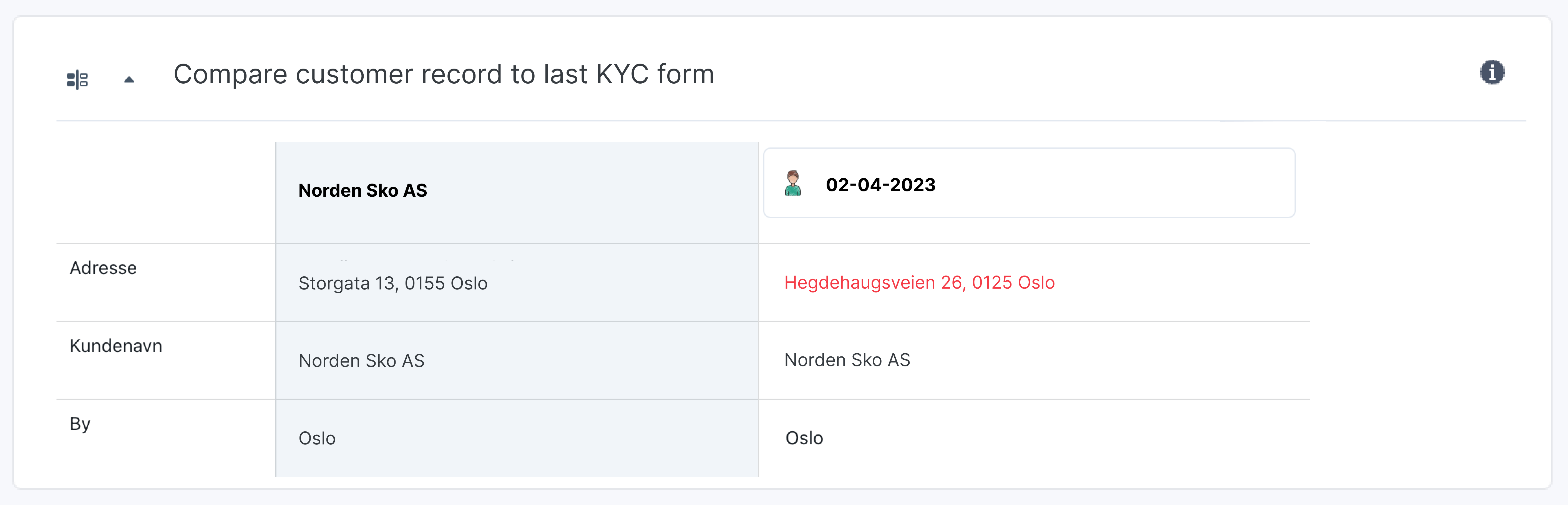
The comparison chart compares how the same data points have changed over time, where each column represents a point in time (e.g. a response date for a submitted form). The “+” and “-“ buttons can be clicked to add or remove columns to the view, so that the user can choose how much history they want to display. Data points that have changed since the previous column will be highlighted in yellow. This highlighting can be turned on or off with the “Show changes” toggle.
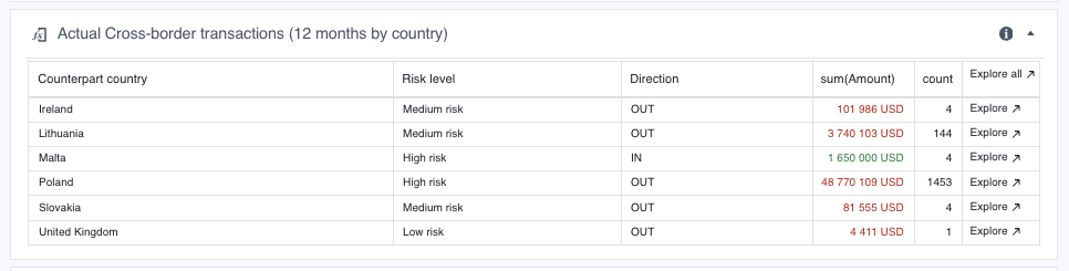
Aggregation comparison chart
The aggregation comparsion chart is used to compare aggregated values from different data sources. An example is shown below, where the chart compares the sum of a customer’s expected transactions to/from a country with the sum of the customer’s actual transactions to/from a country. The “Difference” column shows the difference between the values in the previous two columns. In the example below, a green number means that the actual amount is lower than the expected amount, and a red number means that the actual amount is higher than the expected amount. E.g: a red number in the “Difference” column indicates that the sum of actual transactions with a specific country is outside the bounds of the expected amount.
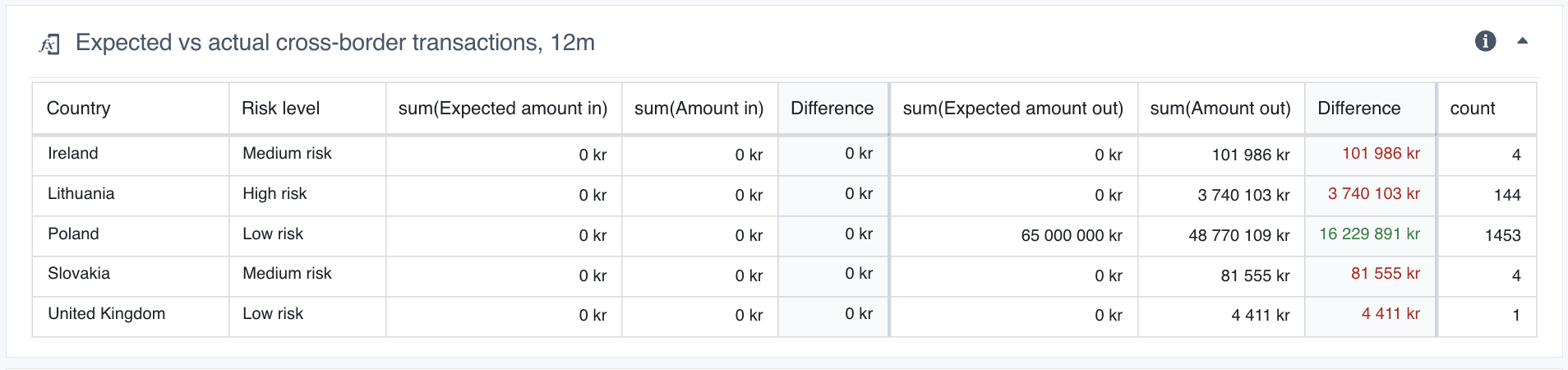
To see the detailed list of objects making up any of the sums (e.g. the list of all singular, actual transactions to a specific country), hover the mouse over the sum in question and click the arrow-button that appears. The selected set of objects will then open in Browse view.
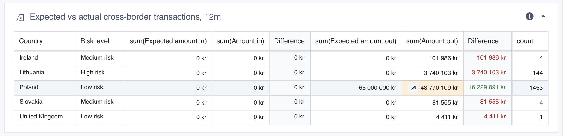 Click the arrow-button inside the highlighted cell to open a Browse view of all actual transactions out to Poland
Risk indicators
A risk indicator is a type of flag that alerts about detected risk on a specific object. The risk indicator will be in triggered or not triggered state based on the result of checks done on the data related to the object. An example of an indicator could be to detect whether a customer has made transactions to a high-risk foreign country.
A risk indicator consists of a status icon, accompanied by a descriptive text explaining the detected risk. The status icon can be in one of three possible states:
- Triggered - red warning triangle: The checked condition was true, and is associated with increased risk
- Triggered - green checkmark: The checked condition was true, and is associated with decreased risk
- Not triggered - gray checkmark: The checked condition was not true
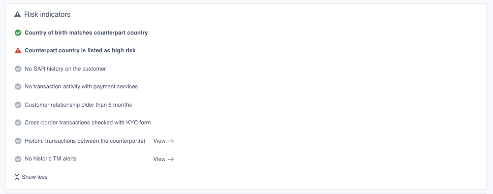 Examples of Risk Indicators on a transaction monitoring alert object
Table of Contents
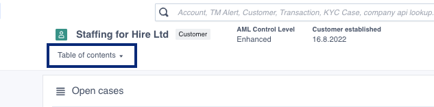
The Table of Contents contains an overview over all subpages and charts belonging to an overview. It can be found by clicking the button in the object view header or at the bottom of the object view front page.
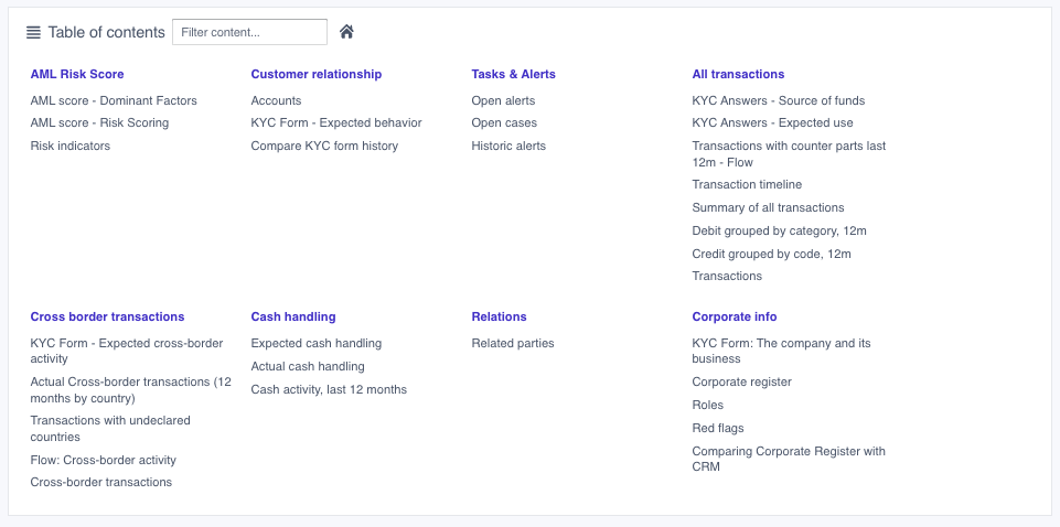
The purple headers int the table represent the subpages, click these to navigate to said subpage. The grey headers represent the charts displayed in each subpage, click these to navigate to that specific chart only. The Table of Contents contains a search bar which allows you to filter the contents of the table.
Subpages
An object view can include several subpages, each containing charts that display information about some topic. The subpages is a way to group and organize information that relates to the object you are viewing. You can see the overview over all subpages belonging to an object view in the Table of Contents.
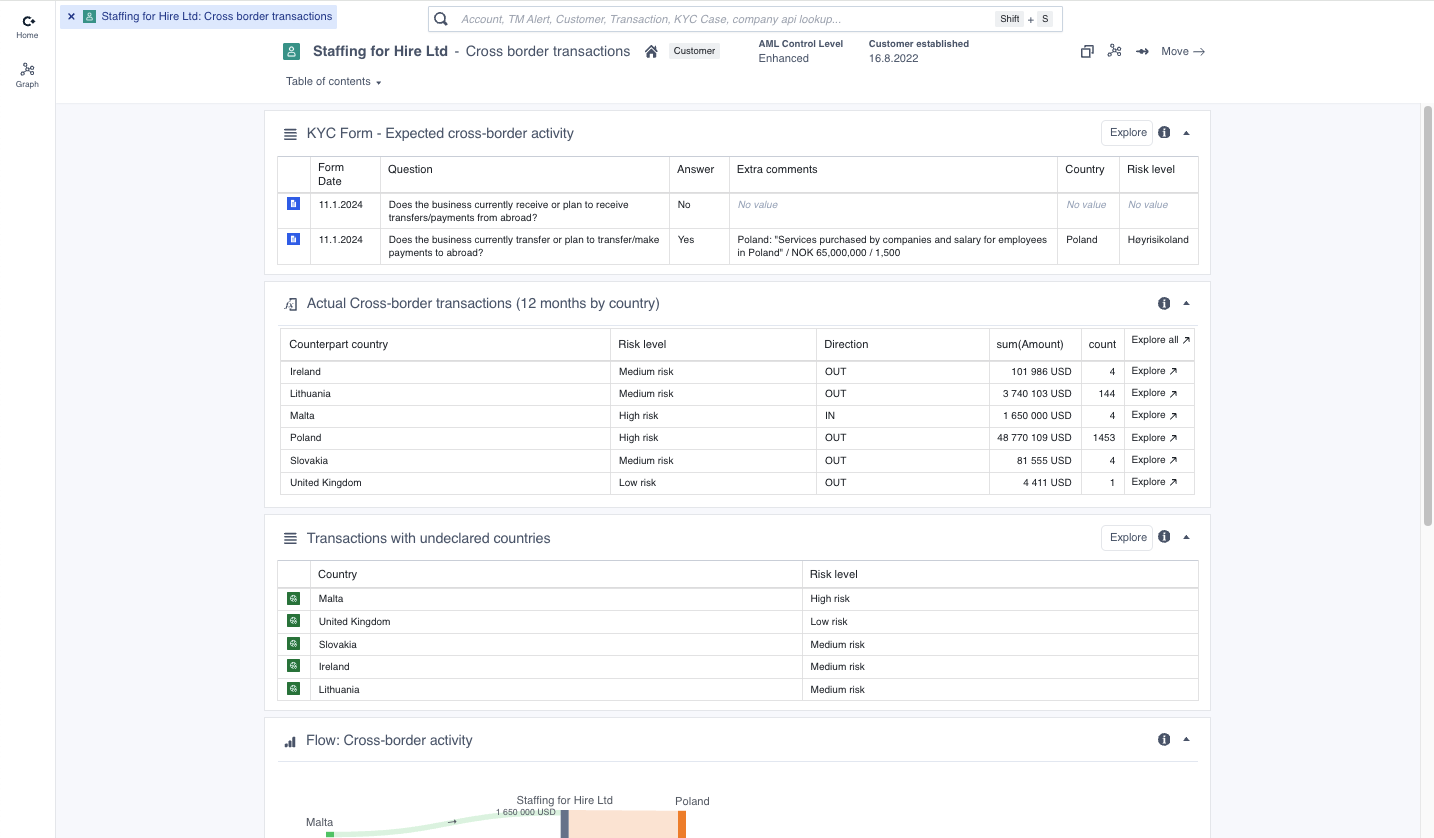 A subpage containing information about cross-border transactions for some customer. Note that the object view header includes information about which sub page that is being viewed.
Reports
A special type of data view is the report view, which allows a user to work through a defined analysis workflow and document their findings. Read more about reporting in the Reporting section